


Reader Comment: White Balance
Rory H writes:
I sometimes find your images to be on the cold side with a blue tint, but due to your expertise and meticulous procedures I’ve assumed the white balance is as precise as you can achieve.
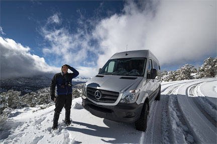
In the images of your van in the snow on the road you have posted two images from the D850 – the first one has a distinct blue tint while the second one, which includes you in the frame, appears to me to be closer to reality.
Am I missing something? Could you include a short blurb in your blog on achieving precision white balance?
DIGLLOYD: I’ve been meaning to add a section on white balance, which is a lot more complicated than it might seem and not solvable by just a gray card or similar, not in outdoor complex lighting or extremely blue conditions.
My white balance choices are usually intentional and not the result of an error. That whites/neutrals should always be neutral is a false premise—who wants to neutralize the warm glow of light at sunset or dusk? Sometimes, but usually not. Even with photographic film “correct” color balance achieved by filtration could look wrong/odd.
When I am in doubt, I check the Lab values of neutrals and near-neutrals to see just how blue/yellow or magenta/green an area is (after 3 X 10-pixel Gaussian Blur). But I temper that with my perceptual reaction.
The first van-only image appealed to me in leaving it bluish because it was very cold and I wanted to evoke that feeling, but it in retrospect it is too blue—but I was in a hurry to complete that post. The 2nd van-and-me image I neutralized because of skin tones (me). Both were choices made intentionally. However, working on an iMac 5K for that post (very contrasty and saturated image display), I cannot judge color as well as on my NEC PA302W (it’s a bit of a hassle to set up and tear down the full dual display system in my van).
There are a number of factors to consider when going for neutrality:
- Perceptual impact: neutral or slightly warm snow often can make the image look too warm (in both meanings of the word). I find that a slight bluish tint is more accurate to perception and feel. However, in full sun this not necessarily so so long as the snow has no yellow tint at all (perfect neutral is OK).
- In shade or at dusk neutralizing the blue looks totally wrong, and can never be done accurately as there are weird crossovers in tint and color—including with high-end cameras like the H6D-100C. So it is better to leave the image somewhat blue.
I could carry a gray card or SpyderCHECKR card, but I’ve found that when color temp goes over about 7000°K neutralizing according to the card almost never looks right. And the color of the card itself is highly variable depending on its orientation to lighting sources. Bottom line: “correct” ≠ pleasing ≠ perceptual and very blue cannot in my experience (with any camera) be corrected without color crossovers.
That said, compare the 4 image variants below. Having now taken the time to asses them, I’d favor the image processed at 5800°K; while the 6000°K image is more neutral overall, it goes a bit too warm for my taste in the central areas. The 5800°K variant is also subtly less magenta (+6M instead of +8M). The magenta/green tint often shifts 10 points from 5000°K to 8000°K (including high-end cameras like the Hasselblad H6D-100C), so this is a subtlety that starts to matter.
Note that the snow right under the van is neutral and that the image goes more and more blue away from that area. Some of that is the lens itself, but I also caught the light/shadow mix such that other areas are actually more blue. It is not possible to neutralize the color across the frame by any simple means, but check out the black and white variant—compare it to the 6000°K image and see the neutral/blue gradient across the snow.
Below, this image was intentionally left bluish—perhaps too much. The next image was neutralized.
NIKON D850 + Zeiss Milvus 15mm f/2.8
ENV: White Mountain Road, altitude 8000 ft / 2438 m, 28°F / -2°C
RAW: LACA corrected
[low-res image for bot]
Below, this image at 5500°K—note the greater neutrality stopped down to f/11, and with sunlight hitting most of the snow across the frame. Going to 5800°K would look too warm for the subject matter.
NIKON D850 + Zeiss Milvus 15mm f/2.8
ENV: White Mountain Road, altitude 8000 ft / 2438 m, 28°F / -2°C
RAW: diffraction mitigating sharpening
selfie, tires and 4WD worked great
[low-res image for bot]